Medibyte App

Product Design • User Interface • Web Design • Front-End Development • Wireframes • Flowcharts • Animation • Prototyping • Branding
Project Overview
Introducing our groundbreaking AI-powered medical startup. We're reshaping healthcare for clinicians and academics by delivering concise research summaries. Our app streamlines information retrieval, elevating clinical knowledge for clinicians and saving time for academics.

Our platform rapidly delivers journals and articles, optimizing content screening. Whether you're a clinician or academic, focus on what matters most to you. Embrace the future of medical research with our AI-driven app, empowering all professionals in their field of study.
My Contributions
I've held a comprehensive role throughout this project, covering every phase of development. This involved ideation, concept creation, user experience mapping, wireframing, in-depth UI analysis, user research and testing, overall design, animation, prototyping, naming, branding, marketing, and full front-end development.

This venture is a passion project and medical startup led by both myself and my business partner, who serves as the lead engineer. Due to our small team, we have established an unconventional approach to role allocation, fostering close collaboration and flexibility in responsibilities.
The Research
In today's medical practice, it's crucial to stay updated with the latest research, often found in online medical journals. However, the cost of subscribing to these journals is extremely high. In 2020, subscribing to just two major journals, AIM and JAMA, cost a total of $3,577. If healthcare providers need more journals, the cost can increase significantly. This can be challenging for healthcare professionals, especially during the COVID era, as journal prices keep rising each year, making it expensive to access essential research.

A study on medical journal usage reveals that 77.9% of medical faculty, 68.2% of nursing faculty, and 86.7% of pharmacy faculty rely on personal subscriptions for articles, highlighting the importance of journals for healthcare providers. Imagine you're a cardiologist aiming to stay updated in your field. Subscribing to key cardiology journals can cost between $150 to nearly $900 per year. Subscribing digitally to six top cardiology journals alone exceeds $2,500 annually.

For practice owners offering journal access to their staff, expenses rise significantly. Providing access to major libraries can cost over $2,000 per institution. Additionally, many subscriptions restrict the number of users, forcing tough decisions on who can access the latest medical knowledge.
Starting with the basics, a minimum viable product
With Medibyte, we embraced a vision and goal, even though much of the project took us into uncharted territory. The tech stack and the integration of AI were novel experiences for both of us. To ensure feasibility, we began with a fundamental approach, testing the waters and validating whether our aspirations were attainable.

To achieve this, we identified an open-source library of self-help books to serve as our database. We delved into understanding the nuances of ChatGPT and honed our skills in training the AI to conduct searches using keywords and phrases. This allowed us to extract lists and establish the requisite parameters to guide the AI in creating chapter-by-chapter summaries of these books.
Round 2: The who, what and why.
With our minimum viable product in place and a solid grasp of GPT intricacies, we progressed to strategic planning and defining our target audience.

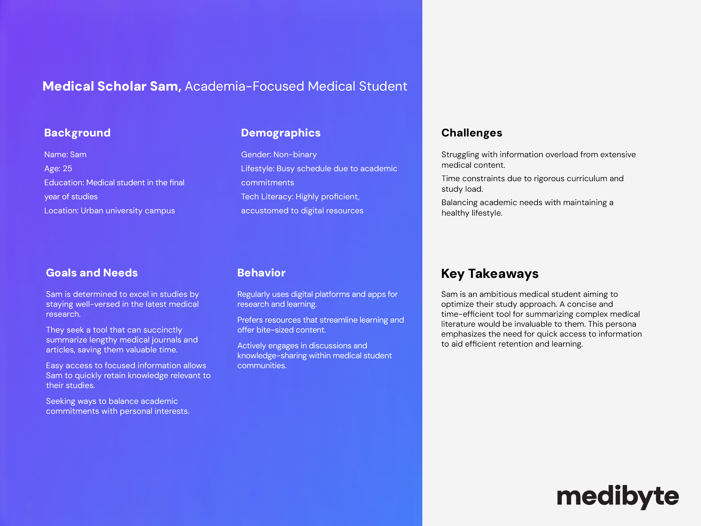
Leveraging my partner's connections in the medical school and residency network, we garnered valuable insights into what prospective users sought in a resource to enhance their learning and knowledge retention. This provided us with a foundation for creating a solution that met their needs. We further refined our understanding through user polls and questionnaires, culminating in the creation of detailed user personas. These personas guided our project decisions cohesively and effectively.
Defining the flow
Once I pinpointed the precise needs and preferences of our potential target audience, I began the initial stage of defining our application's flow and structural layout. Acknowledging our small team of two, we adopted an adaptable approach, allowing room for future refinements and iterations. This pivotal moment was instrumental in laying the foundation for the initial development process, while remaining open to revisiting and enhancing the structure as needed.
Wireframing
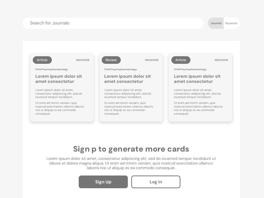
Following the initial attempt at defining the flow and the necessary screens, I transitioned into crafting wireframes to delve deeper into the user experience on a screen-by-screen basis. The central focus revolved around the seamless transition from a collapsed masonry card to an expanded detail card, a pivotal interaction within the app's core functionality. This approach allowed for a more comprehensive exploration of the user journey and interaction dynamics.
Visual exploration
Subsequently, I delved into shaping the overall visual identity of the app. Given my sole involvement in design decisions, I acknowledged the flexibility to refine and adapt the design language over time. With the app's objectives in mind, we aimed for a clean and straightforward interface that places the spotlight on card content and articles, minimizing distractions from the core functionality.

Our chosen aesthetic is clean and simple, serving to elevate content while creating a clutter-free environment. This approach not only emphasizes content but also fosters a sense of openness, making text-heavy blocks feel more accessible and spacious, thus enhancing readability.

Want to get in touch?
Drop me a line!

Thank you! Your submission has been received!
Oops! Something went wrong while submitting the form.